Showing posts with label customization. Show all posts
Showing posts with label customization. Show all posts
Wednesday, February 11, 2015
Conditional coloring of cell values in pentaho CDE table component Table component customization
Hello Guys,
This post will talk about one of the major component of pentaho CDE. i.e., Table component.
Table component is offering many features like sorting, searching, pagination, selected number of rows per page on the dashboard....
Some times we may not need these built in features but need our own features like conditional coloring of cell values .. In that case the below customization tips might useful for you..
This post will brief about below features.
1. Removing default row banding.
2. Give back ground color table headers.
3. Group by table component.
4. border to all the cells
5. bar Type cell feature along with value.
6. trendArrow cell type feature along with value.
7. circle type cell ( not customized yet, will try to workout in future posts).
8. color change of pagination buttons
9. conditional coloring of cell values.
Future work outs on the table component.
1. Expand rows.
2. Removing groupHeader preSpace & groupHeader postSpace (if any one done this please post your solution in comment box).
3. Difference b/w Hyperlink type cell and hyperlink on table rows.
4. Group by summation values.
5. Summation of table columns either page wise or total.
Id already posted tool tip on table component cell values.
You can refer that example here along with example code .
Readers of this post is encouraged to add your solutions for the future work outs if you have already done in comment box.. That will be very helpful for the community developers.
Of course, most of the things can be done using css overriding but it is a bit matter on implementing in CDE.
Software Setup :
Pentaho BA Server 5. 0.1 CE , C-Tools(CDE,CDF,CDA) of Trunk (after 14 verion), foodmart database of postgesql(formally jasper server back end database), Mozilla fire fox along with fire-bug Addin.
Id like to share the core part of the example and the remaining things you can see by opening the example(source code) attached later here.
Basics about table component.
1. You can give types (CDE+data tables types) to the columns for table component(which differs from
2. You can insert charts for the cell values.
3. You can give hyperlink types (should take hyperlink values - not the regular hyperlink)
Steps :
1. From Lay out section Row - Column(give html Object Name)
2. From Datasource section give code an SQL query for your table component.
For example: (Name it : query1_TableComponent) assuming you are already aware of giving connections.
select distinct state_province AS state,
city,
CASE WHEN sum(unit_sales)<=5000 THEN sum(unit_sales) ELSE 9000 END UnitSales,
CASE when sum(store_sales)>=3000 then sum(store_sales) ELSE -sum(store_sales) END StoreSales,
sum(unit_sales) UnitSales2,
sum(store_sales) StoreSales2,
sum(unit_sales) UnitSales3,
sum(store_sales) StoreSales3
from sales_fact_1997 sf7
INNER JOIN customer c ON sf7.customer_id=c.customer_id where country like USA
group by state_province ,city
ORDER BY state_province ,city
Output actions proprery:
Give indexes to your query output: In the above query you are having 8 columns so you will be giving 0,1,2,...7 indexes.
3. Components section :
Add table component as you generally do and name it and give datasource name and give below types to each of the columns..
 In the Pre-Execution section you need to write Add-ins code for customization. If you dont write add-in code, the cells will take default behavior of types.
function f(){
//conditional coloring of cells
this.setAddInOptions("colType","formattedText",function(cell_data){
var percentage = cell_data.value;
if(cell_data.colIdx == 7) // column index
{
if(cell_data.value === || cell_data.value === null) //checking the null possibility
{
this.value = 00000;
}
}
if(percentage <=8000){
return { textFormat: function(v, st) { return "<span style=color:red>"+v+"</span>"; } };
}
else {
return { textFormat: function(v, st) { return "<span style=color:green>"+v+"</span>"; } };
}
});
//bars
this.setAddInOptions("colType","dataBar",function(column4){
return {
includeValue:true,
widthRatio: 0.8,
startColor: "red",
endColor: "green"
};
});
//trendArrow
this.setAddInOptions("colType","trendArrow",function(column5){
return {
includeValue: true,
good: false,
valueFormat: function f(v) { return "$" + sprintf(%d, v/1000) + k; }
};
});
}//main function ending
The core part of this post is conditional coloring of cells... the first part of the above code will conditionally apply the color to the cells.. itll give some idea on how to increase the chances of customization on table component.
The other goal of the post is : removing and styling table component using css code. .
Either you can apply below css code in External file and locate or A Code snippet for the dashboard..
In this demonstration, Ive taken it in Code Snippet and code is :
body{
margin-top: 0.5cm;
}
.overflow {
overflow: auto;
}
#The below will remove default -row banding
table .even, table .odd{ background-color: white; }
table
{
align-left:200px;
}
#This will add back ground styling for table header row
table th {
background: black;
border: 1px none #B3B3B3;
color: #FFFFFF;
font-family: Century Gothic;
font-size: 14px;
font-weight: bold;
text-align: center;
}
#This will add borders to the cells
table td {
border-left: 1px solid #A9A7A1;
border-right: 1px solid #A9A7A1;
border-top:1px solid #A9A7A1;
border-bottom:1px solid #A9A7A1;
height: 20px;
font-size:14px;
/*padding-left: 10px;*/
vertical-align: middle;
}
#This will be useful for changing the style of pagination symbols.
.paging_full_numbers span.paginate_active {
background-color: #FF0000;
}
.paging_full_numbers span.paginate_button, .paging_full_numbers span.paginate_active {
border: 1px solid #008000;
cursor: pointer;
margin: 0 3px;
padding: 2px 5px;
}
.paging_full_numbers {
line-height: 18px;
}
.dataTables_paginate {
text-align: center;
}
Download the example here and play around with it.
or
https://drive.google.com/file/d/0BymV_QP4TGBEU09kN1VUVGJRdVE/edit?usp=sharing
 Sadakar
BI developer
This post will talk about one of the major component of pentaho CDE. i.e., Table component.
Table component is offering many features like sorting, searching, pagination, selected number of rows per page on the dashboard....
Some times we may not need these built in features but need our own features like conditional coloring of cell values .. In that case the below customization tips might useful for you..
This post will brief about below features.
1. Removing default row banding.
2. Give back ground color table headers.
3. Group by table component.
4. border to all the cells
5. bar Type cell feature along with value.
6. trendArrow cell type feature along with value.
7. circle type cell ( not customized yet, will try to workout in future posts).
8. color change of pagination buttons
9. conditional coloring of cell values.
Future work outs on the table component.
1. Expand rows.
2. Removing groupHeader preSpace & groupHeader postSpace (if any one done this please post your solution in comment box).
3. Difference b/w Hyperlink type cell and hyperlink on table rows.
4. Group by summation values.
5. Summation of table columns either page wise or total.
Id already posted tool tip on table component cell values.
You can refer that example here along with example code .
Readers of this post is encouraged to add your solutions for the future work outs if you have already done in comment box.. That will be very helpful for the community developers.
Of course, most of the things can be done using css overriding but it is a bit matter on implementing in CDE.
Software Setup :
Pentaho BA Server 5. 0.1 CE , C-Tools(CDE,CDF,CDA) of Trunk (after 14 verion), foodmart database of postgesql(formally jasper server back end database), Mozilla fire fox along with fire-bug Addin.
Id like to share the core part of the example and the remaining things you can see by opening the example(source code) attached later here.
Basics about table component.
1. You can give types (CDE+data tables types) to the columns for table component(which differs from
2. You can insert charts for the cell values.
3. You can give hyperlink types (should take hyperlink values - not the regular hyperlink)
Steps :
1. From Lay out section Row - Column(give html Object Name)
2. From Datasource section give code an SQL query for your table component.
For example: (Name it : query1_TableComponent) assuming you are already aware of giving connections.
select distinct state_province AS state,
city,
CASE WHEN sum(unit_sales)<=5000 THEN sum(unit_sales) ELSE 9000 END UnitSales,
CASE when sum(store_sales)>=3000 then sum(store_sales) ELSE -sum(store_sales) END StoreSales,
sum(unit_sales) UnitSales2,
sum(store_sales) StoreSales2,
sum(unit_sales) UnitSales3,
sum(store_sales) StoreSales3
from sales_fact_1997 sf7
INNER JOIN customer c ON sf7.customer_id=c.customer_id where country like USA
group by state_province ,city
ORDER BY state_province ,city
Output actions proprery:
Give indexes to your query output: In the above query you are having 8 columns so you will be giving 0,1,2,...7 indexes.
3. Components section :
Add table component as you generally do and name it and give datasource name and give below types to each of the columns..
function f(){
//conditional coloring of cells
this.setAddInOptions("colType","formattedText",function(cell_data){
var percentage = cell_data.value;
if(cell_data.colIdx == 7) // column index
{
if(cell_data.value === || cell_data.value === null) //checking the null possibility
{
this.value = 00000;
}
}
if(percentage <=8000){
return { textFormat: function(v, st) { return "<span style=color:red>"+v+"</span>"; } };
}
else {
return { textFormat: function(v, st) { return "<span style=color:green>"+v+"</span>"; } };
}
});
//bars
this.setAddInOptions("colType","dataBar",function(column4){
return {
includeValue:true,
widthRatio: 0.8,
startColor: "red",
endColor: "green"
};
});
//trendArrow
this.setAddInOptions("colType","trendArrow",function(column5){
return {
includeValue: true,
good: false,
valueFormat: function f(v) { return "$" + sprintf(%d, v/1000) + k; }
};
});
}//main function ending
The core part of this post is conditional coloring of cells... the first part of the above code will conditionally apply the color to the cells.. itll give some idea on how to increase the chances of customization on table component.
The other goal of the post is : removing and styling table component using css code. .
Either you can apply below css code in External file and locate or A Code snippet for the dashboard..
In this demonstration, Ive taken it in Code Snippet and code is :
body{
margin-top: 0.5cm;
}
.overflow {
overflow: auto;
}
#The below will remove default -row banding
table .even, table .odd{ background-color: white; }
table
{
align-left:200px;
}
#This will add back ground styling for table header row
table th {
background: black;
border: 1px none #B3B3B3;
color: #FFFFFF;
font-family: Century Gothic;
font-size: 14px;
font-weight: bold;
text-align: center;
}
#This will add borders to the cells
table td {
border-left: 1px solid #A9A7A1;
border-right: 1px solid #A9A7A1;
border-top:1px solid #A9A7A1;
border-bottom:1px solid #A9A7A1;
height: 20px;
font-size:14px;
/*padding-left: 10px;*/
vertical-align: middle;
}
#This will be useful for changing the style of pagination symbols.
.paging_full_numbers span.paginate_active {
background-color: #FF0000;
}
.paging_full_numbers span.paginate_button, .paging_full_numbers span.paginate_active {
border: 1px solid #008000;
cursor: pointer;
margin: 0 3px;
padding: 2px 5px;
}
.paging_full_numbers {
line-height: 18px;
}
.dataTables_paginate {
text-align: center;
}
Download the example here and play around with it.
or
https://drive.google.com/file/d/0BymV_QP4TGBEU09kN1VUVGJRdVE/edit?usp=sharing
BI developer
Sunday, February 1, 2015
Android beginner tutorial Part 11 TextView customization
As I said in the previous tutorial, the class has multiple methods and attributes. Besides android:text attribute, there are a few other that are considered one of the most commonly set attributes. These are android:textSize, android:textStyle and android:textColor.
The android:textSize attribute sets the size of the displayed text. The possible units of measurement here are:
- px - pixels
- dp - density-independent pixels
- sp - scale-independent pixels
- in - inches
- pt - points (1/72 of an inch)
- mm - millimeters
Usually the "sp" unit is used, which displays fonts more correctly.
Example:
android:textSize="32sp";
The next attribute, android:textStyle, sets the style of the text and has 3 possible values - normal, bold and italic.
Example:
android:textStyle="bold";
The android:textColor attribute sets the color of your text. It has 4 possible value formats:
- #RGB
- #ARGB
- #RRGGBB
- #AARRGGBB
Where R - red, G - green, B - blue, A - alpha channel. The alpha channel value ranges from 0 to 1.
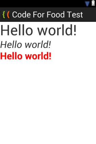
Now lets create a simple example, which displays the same text in 3 different TextViews.
Open our test Android project, go to res/values/strings.xml file and edit it to add a string that holds a "Hello world!" text, with an id "helloText":
<?xml version="1.0" encoding="utf-8"?>
<resources>

    <string name="app_name">Code For Food Test</string>
    <string name="helloText">Hello world!</string>
    <string name="menu_settings">Settings</string>

</resources>
Now go to activity_main.xml in res/layout/ to add 3 TextViews to the Activity:
<LinearLayout xmlns:android="http://schemas.android.com/apk/res/android"
    xmlns:tools="http://schemas.android.com/tools"
    android:layout_width="match_parent"
    android:layout_height="match_parent"
    android:orientation="vertical"
    tools:context=".MainActivity" >

    <TextView
        android:layout_width="wrap_content"
        android:layout_height="wrap_content"
        android:text="@string/helloText"
        android:textSize="48sp"/>

    <TextView
        android:layout_width="wrap_content"
        android:layout_height="wrap_content"
        android:text="@string/helloText"
        android:textSize="32sp"
        android:textStyle="italic"/>

    <TextView
        android:layout_width="wrap_content"
        android:layout_height="wrap_content"
        android:text="@string/helloText"
        android:textSize="32sp"
        android:textStyle="bold"
        android:textColor="#f00"
        />

</LinearLayout>
The results:
Thats all for today.
Thanks for reading!
Subscribe to:
Posts (Atom)